By default, the SELECT task displays your lights. The Grid
consists of cells, each one representing a single light in the show. Each
cell can have varying amounts of information depending on the zoom level
![]() describing the current state of that light. You
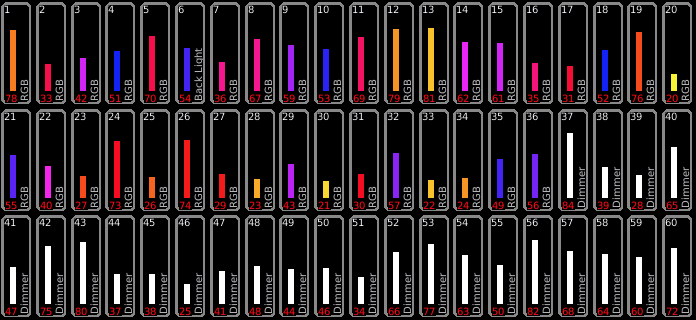
may see as few as 10 lights or as many as 100. This is what 60 lights
look like in the SELECT task.
describing the current state of that light. You
may see as few as 10 lights or as many as 100. This is what 60 lights
look like in the SELECT task.

There may be fewer lights shown if you've applied a ![]() Filter. Here are the details shown in each cell
at the highest zoom level.
Filter. Here are the details shown in each cell
at the highest zoom level.

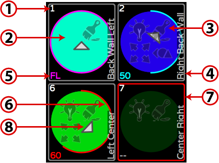
1: Light Number. The number in the upper left hand corner of each cell identifies each light in the show. The Light number is not the same as the light’s DMX address.
2: Color Indicator. For color-changing lights, the background of the circle provides an indication of the light’s current color. If a gel has been associated with a traditional dimmer, the gel color will be shown.
3: Attribute Indicator. Icons
indicate whether Intensity ![]() ,
Color
,
Color ![]() , Position
, Position ![]() or Shape
or Shape ![]() attributes have recently changed, whether from manual
manipulation in the CONTROL task or from running cues in Playlists.
attributes have recently changed, whether from manual
manipulation in the CONTROL task or from running cues in Playlists.
4: Light Name. By default, the model of light that each cell represents appears in the lower right hand corner of each cell. If a name has been assigned using SELECT | SETTINGS | PROPERTIES, that text will appear in place of the model.
5: Intensity Level. The
current intensity of the light is shown as a percentage, in the lower
left hand corner. “FL” indicates the light is at full. When
no lights are selected and ![]() Information is
activated, this number changes to the light’s DMX
start address. With a light or multiple lists selected, pressing
Information is
activated, this number changes to the light’s DMX
start address. With a light or multiple lists selected, pressing ![]() will show more detail on what is controlling the lights'
attributes.
will show more detail on what is controlling the lights'
attributes.
The color used to display the light's intensity also provides information about where it was set from or why it changed.
Color |
Attribute Condition |
■ Gray |
Default level (normally 0%) |
■ Yellow |
Level controlled by a Memory |
■ Red |
Captured in SELECT |
■ Magenta |
Level unchanged in last Cue |
■ Cyan |
Level increased in last Cue |
■ Green |
Level decreased in last Cue |
6: Intensity Indicator. The circular, colored line within each cell (red in the example above) provides a quick indication of the light’s current intensity. The color also indicates how the intensity was set and if it’s currently changing. See Information for descriptions.
7: Select Indicator. The
border around each cell turns red when the light has been chosen
for programming. This icon ![]() shows
how many lights are selected. If there is an # in this box, only one light
is selected and the number is the Light's number.
shows
how many lights are selected. If there is an # in this box, only one light
is selected and the number is the Light's number.
8: Orientation Indicator. For lights with position attributes, the triangular pointer at the center of the circle shows the direction the light is pointed.
See Also: Light Selection