Working with Touch Interfaces
A touch interface is created when a touch device is added to the project.
Touch Interface Configuration
The configure device interface helper will guide you through setting up the device’s interface and available controls.
 Edit interface – here you can:
-
Select a theme – the theme defines the overall layout of the interface. There are currently two different choices for the theme.
-
Select a skin – the skin defines a particular appearance for the theme. There are many different choices for the skin. In this section you can opt to Link skins to Conditions.
-
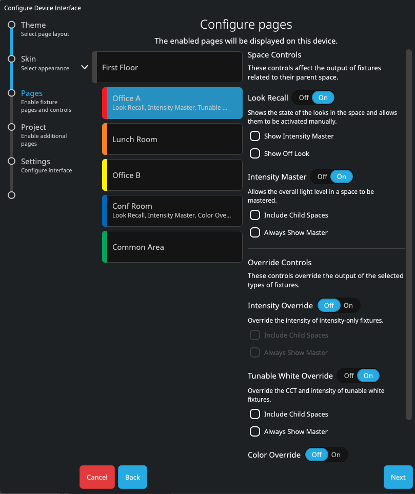
Configure pages for spaces – select a space to choose which pages will be displayed in this interface for the selected spaces. Click the drop down arrow to the left of a parent space to reveal any child spaces or Groups.
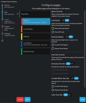
In this option you can select individual Spaces or Group using Ctrl+click on individual items, or all items using Shift+click or Click+drag. The options are:
-
 Look Recall – only available for Spaces - enabling this option will display the Looks that are assigned to the chosen space. This will allow the user of the touch screen to manually fire any of the Looks when selecting the space on the Touch device. There are additional options to include the Off Look for each Space, and to include the Intensity Master on the page.
 -
 Intensity Master – only available for Spaces - enabling this option will display a Master Intensity slider for the chosen space or Group. An Intensity Master will scale the intensities for the fixtures in the space, allowing them to maintain their difference. For more information regarding fixture behaviour see Intensity and Override Rules.
 -
 Intensity Override – available for Spaces and Groups - enabling this option will display an Intensity Override slider for the chosen space or Group. An Intensity Override will force the intensities for the fixtures in the space to go to the set value, ensuring all are uniform. For more information regarding fixture behaviour see Intensity and Override Rules.
 -
 Tunable White Override – available for Spaces and Groups - enabling this option will display a color Temperature slider for the chosen space or Group. This will force all the fixtures in the space that have a color Temperature parameter to use the new value set by the slider when it is moved. For more information regarding fixture behaviour see Intensity and Override Rules.
 -

For more information regarding fixture behaviour see Intensity and Override Rules. For detailed examples of how each of these overrides can be used, see this video.
-
-
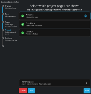
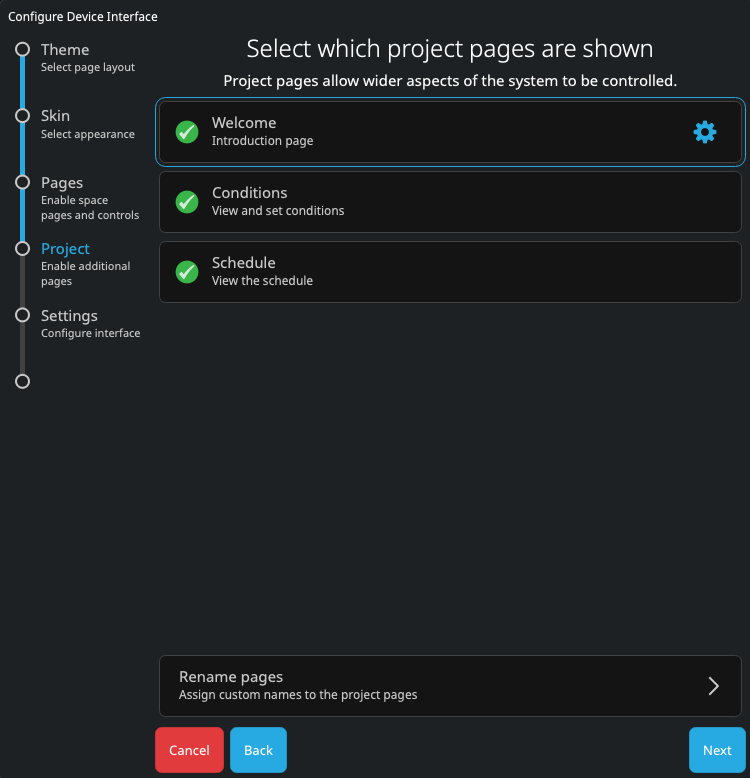
Select which project pages are shown – additional pages can be displayed on the Interface by choosing them from this page.
-
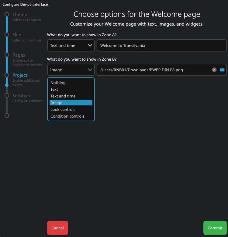
Selecting Welcome will optionally provide a landing page for the interface. This page can be customised by clicking the cog icon
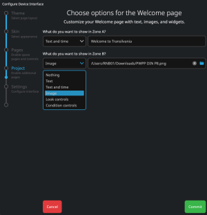
 . Both sections of the welcome page can be customised individually, with Zone A formatting content in the top section of the page, and Zone B the bottom. The options for each zone are:
-
-
Nothing – No content for this zone. If either zone is set to ‘Nothing’ then the content of the other zone will be formatted for the whole page.
-
Text – Input text formatted to match the current Theme and Skin.
-
Text and time – Input text to be shown along with the controller's current date and time. Date and time formats defined in the Project Properties – accessed via the main menu in Pathscape Create – will be respected. All text is formatted to match the current Theme and Skin.
-
Image – display an image in the selected zone. Pathscape Create supports images in .png or .jpg format. Images are scaled to fit the screen with the aspect ratio maintained. Images formatted with .png will support transparency.
-
Look controls – adds a given space's Look to the welcome page to allow users to easily adjust the active Look. Live feedback for which Look is active in a space is provided.
-
Condition controls – adds a given Condition set to the welcome page to allow users to easily adjust the active Condition. Live feedback for which Condition is active in a Condition set is provided.
-
Selecting Conditions will allow the user of the touch device to manually change any of the Conditions that are included in the project, which will allow for manually overriding the current State.
-
Selecting Schedule will allow the user of the touch device to view all schedule events, these events can be filtered by Space or Condition.
-
Space, Condition and Schedule pages can be renamed. This will adjust the names in navigation.
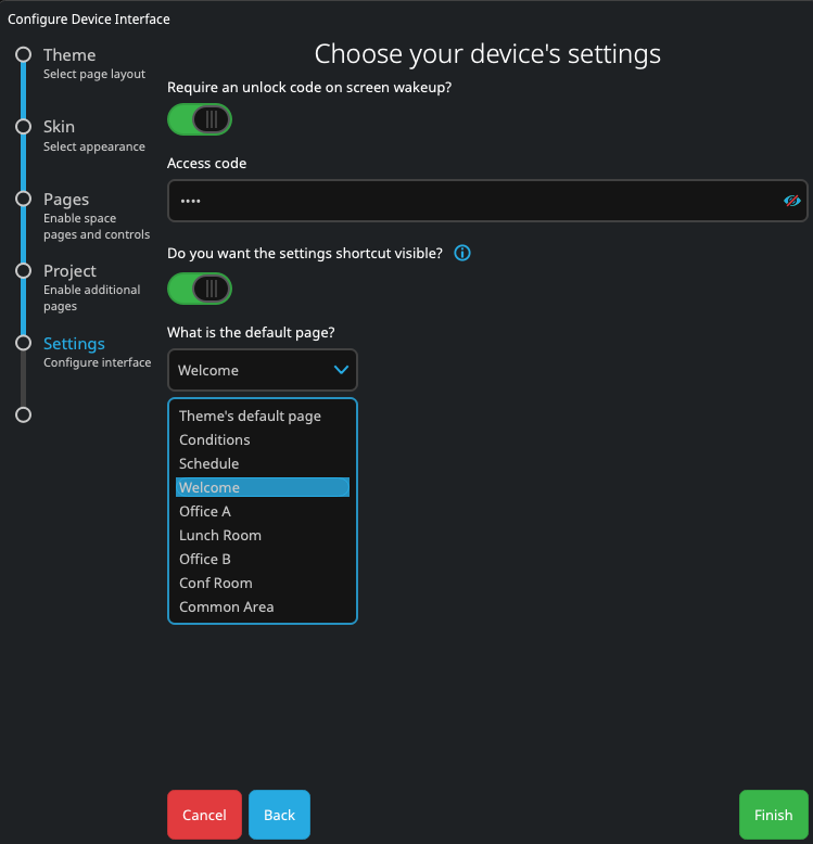
Choose your touch device’s settings
-
In this section you can select to Require an unlock on screen wakeup? If activated, you will need to add a four to eight digit code.
-
Specify whether the settings shortcut is visible. The settings shortcut enables easy user access to adjust a connected device’s pairing setting and other important configuration options such as network and display.
-
Select an interface's default page. This page will be shown after the controller boots or is activated after becoming inactive.
Interface override rules
When lighting changes (typically Look, intensity or color overrides) have been initiated by a user on a touch device or from the web interface or Cloud portal control panels, those modifications will maintain until Controller has a scheduled or Condition based change of state in programming, at which point the programmed lighting state will output. For more detail on fixture override rules see here.